Well, that's what happened to me with the challenge at Color Hues... LOL.
The combination of orange and slate grey was very challenging for me at first, but after I made my card for the challenge (you can see it HERE), I began to like this color combo so much, so I made another card!
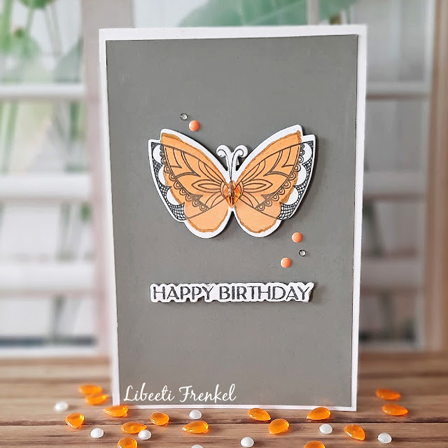
I stamped the butterfly's wings (My Favorite Things 'Brilliant Butterflies' stamp set) in two shades of orange (dried magigold distress oxide and Pinkfresh apricot). The lacy wings and the body were stamped with Ranger's watering can ink, and so was the sentiment (Waffle Flower 'Elegant Sentiments' stamps and dies set).
I adhered all the elements to the slate grey cardstock with foam dots, and added some enamel dots in orange, a translucent gem in orange in the middle of the body, and some clear dots.
The whole panel were adhered on the white basis.
Challenges:
Less Is More #483 - Spring, as spring is full of butterflies all around:
I was inspired by the different shades of orange and the butterfly.
I believe my next card is going to be totally different...
Thank you for visiting my blog. Your comments are much appreciated.


10 comments:
I love the orange and gray color combo! Your butterfly is so pretty and unique! SO happy you joined us The Paper Players this week!
You did a fantastic job your card is beautiful and the colour combo works beautifully.Thank you so much for playing along with us at LIM with this beauty.
Marie
I actually love this color combo... So stylish! And your butterfly is very pretty too. Than you for joining us at Inkspirational!
I love reading that a cardmaker was at first apprehensive about a color combo and by the end they loved it. I love your butterfly card a lot, Libeeti! It is pure CAS magic! The gems are placed perfectly too. Thanks for playing along at Color Hues!
I thought this was a challenging colour combo too but your orange butterfly stands out beautifully against the grey and the colour really draws the eye in to your focal point. Thanks for playing along with my CAS challenge over at The Paper Players this week!
I had trouble with these colors too, as many of our players and designers have shared. But like you, I've come to love these colors together. Your card is classic and so elegant - a fabulous design! Thanks so much for joining us at Color Hues!
This is beautiful, Leebti! Thank you for sharing it with us at The Paper Players.
Xoxo, Fran
The orange pops so well on that background. Perfect to show off that pretty butterfly. Thanks so much for sharing with us at LIM.
Such a beautifulchoice of colors! Love your card!
The struggle was so worth it! Your card is so beautiful !
Thanks for playing with us at Color Hues!
Post a Comment