Honourable Mention
November 2019
The 1st - More Than Words challenge - success plus a key:

When I look back, I realize that the most successful things in my life were things I dreamt about, and then made them happen. So for me 'if you can dream it, you can do it' is the key to success. I also adhered a small key next to the message, to make it stand as my say.
The 2nd challenge is the color challenge from Lindy's Gang blog, with this beautiful color palette:

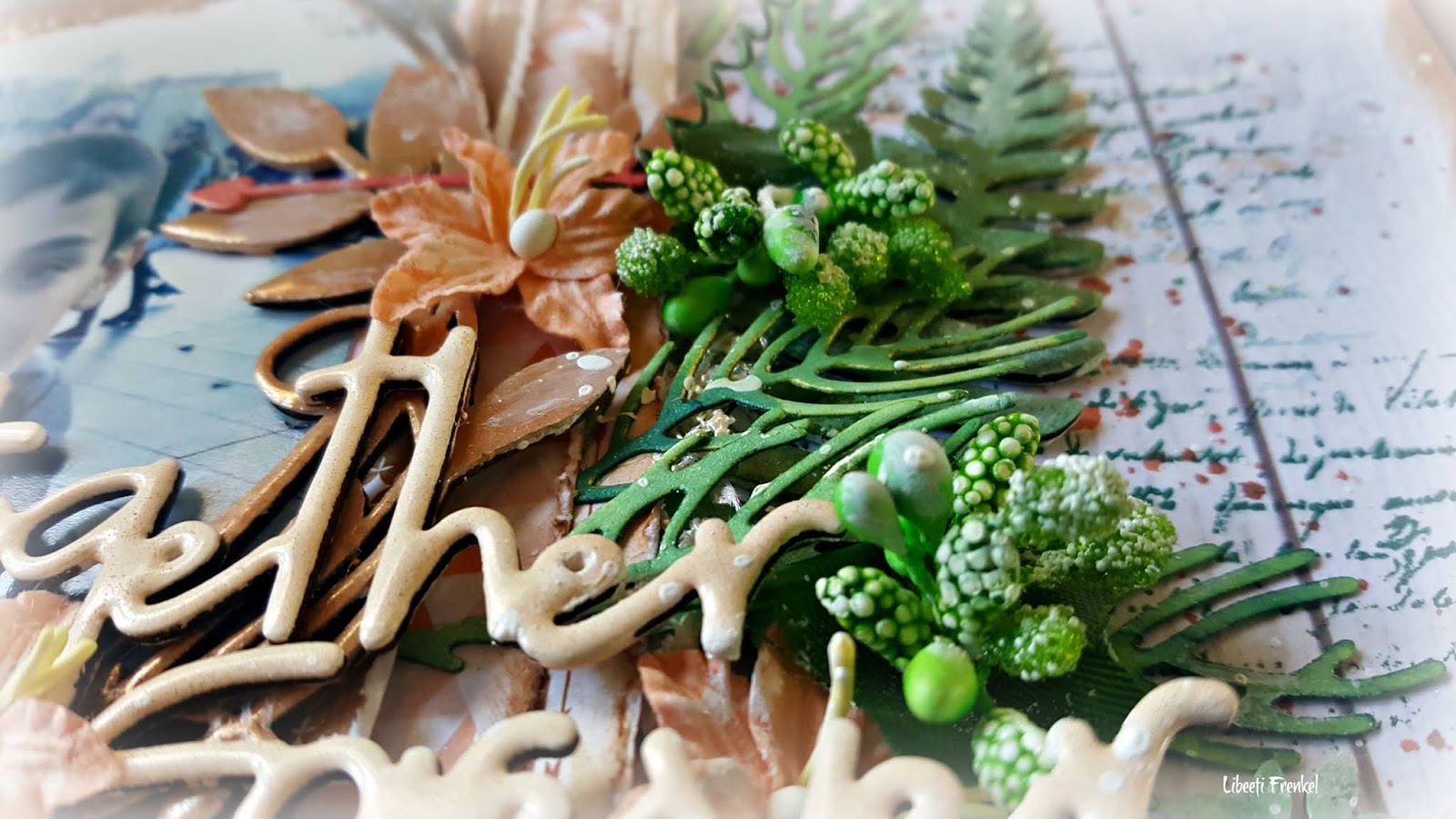
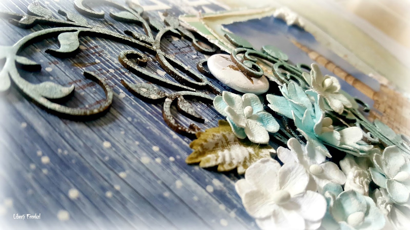
Here're some close-ups on the details:


Lindy's products I've used:
Starburst sprays: Opal Sea Oats, Drop Dead Gorgeous Green, Shabby Turbine Teal.
Moon Shadow Mist: Buccaneer Bronze.
Flat Magical: Caribbean Cruise set (Luscious Lime)
Shakers: Gutten Tag Teal.
Embossing powders: Brutwrust Brown, Spring Leaf Chartreuse, Gutten Tag Teal.
Other products:
Prima Finnabair art basics: gesso clear, gesso white, soft matte gel.
Prima Finnabair extravgance: patina effect paste blue.
Prima Finnabair Art Daily stamps: Dream without fear set.
Stampers Anonymous TH stamps: mini motivation set.

Thank you for visiting my blog. I appreciate your comments very much.
Ranger's inks: archival ink jet black, embossing ink clear.
VersaFine inks: smoky gray, toffee