Showing posts with label jute. Show all posts

Saturday, February 5, 2022

To a Dear Friend


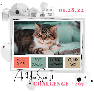
I was very intrigued by the colors given at As You See It challenge blog, and wanted to give it a go.

Here's the inspiration photo:

I die cut the flower and colored it with inks in Ranger's Tea Rose archival ink, TH Bundled Sage disress ink and Ranger's Library Green archival ink. Then I adhered it to another 3 identical die cuts. to give some dimension.

I die cut twice the leaves and colored them with Bundled Sage disress ink.

I embossed a dark greenish/turquoise dp and adhered it to the bottom of a kraft cs, and above it I added a jute and lace ribbon.

I adhered the flowers and the leaves on top. The sentiment (Stampin' Up) was stamped with the dark green ink on a kraft cs, fussy cut around and mounted on a sage cs, and then I adhered it on the ribbon.

The panel was matted with dark green cs and then mounted on the kraft cs basis.


As I really love this color combo, I just might use it for another card, this time a more masculine one.

It goes for the following challenges:

As You See It - photo inspiration/colors:

Thank you for stopping by. Your comments are much appreciated.


Saturday, November 13, 2021

Thanks - a recipe for neutrals

One of the FAV 

On one hand, making cards in neutrals colors can be very challenging. On the other hand, these colors make a very elegant combination. And who doesn't love a card in neutrals colors?!

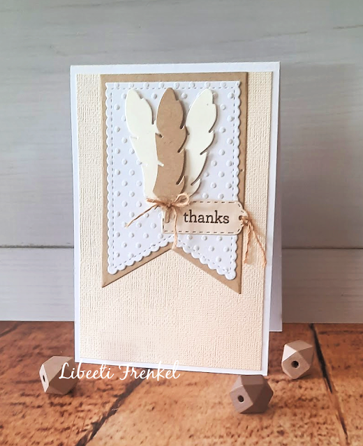
So I took inspiration from the challenge at As You See It challenge blog, whith a recipe for a neutrals card: to use an embossing folder, a ribbon or a twine, a die or a punch, one sentiment - and all that with neutrals:


I chose to work with the neutrals colors white, vanilla and kraft - for my cs, and brown ink for the sentiment.

I followed the sketch from Tuesday Morning Sketches #631:


The banners, the feathers and the tag - where cut with dies. The white stitched banner was embossed using dots embossing folder. 

I tied a bow around all the feathers with a jute twine, which also was used to tie a knot on the tag.

A one sentiment 'thanks' was stamped on the tag, and I adhered it beneath the feathers.


It goes also for the 'thanks' challenges at SimonSays Monday challenge, and SimonSays Wednesday challenge.

Thank you for stopping by. Your comments are much appreciated.
Saturday, August 15, 2020

Capture the Moment

One of the TOP 3 at Challenge YOUrself

Case file no. 328 at CSI has a wonderful beach/ lake side theme:
It was just perfect for our sailing photo, taken last year at Lake Como in Italy.
I used all 5 colors and from the evidence I took: stripes, grid pattern, beach elements, camera, circular elements, anchor and fringe.
I followed Laura Whitaker's sketch for Sketches In Thyme no. 431:
I'm an old fan of Laura's sketches!
Another challenge this layout goes for, is the August challenge at Challenge YOUrself - I'm on vacation:

I was also inspired by the marine inspiration photo at Creative Embellishments:
I was inspired by the blue and green colors of the water and used scalloped pattern under my photo.
The background was made in smooching technique, using Lindy's sprays: Tibetan Poppy Teal and Aloha Avocado.
I used some CE products - camera chipboard (heat embossed with Lindy's Orange Creamsicle ep),
fishnet background stamp and the chipboard title (heat embossed with Lindy's Spring Leaf Chartreuse ep and Guten Tag Teal ep, and then colored here and there with Lindy's Tibetan Poppy Teal shimmer spray).
To make the steering wheel and the anchor I die cut eace shape several times from a watercolor paper and glued together, so I got kind of chipboards.
The steering wheel was covered with pp with life buoy pattern (the same as I coverd the half circles).
The anchor was painted with Finnabair's Rich Copper Metallique Wax. I glued Finnabair's mini art stones, and colored the anchor again with Lindy's Tibetan Poppy Teal spray. After it was dried, I wraped it with a wax cord. I really love the aged look it got!
Some Robbin's Nest transparent drops added to the water drops look.


Thank you for visiting my blog. I appreciate your comments very much!


Monday, August 10, 2020

A wedding card, in natural colors

A Top Cookie

I made this card for an inspiration post, about using sketches, in a local FB group.
I used an old (but good!) CAS(E) This Sketch - sketche #329:
My take is a bit loose... I took some major elements from the sketch and made it my own - the geometric background, the leaves element.
I made my card in natural colors and feeling, and it was given for a wedding party.
I would like to submit it to the following challenges:
I was inspired by the colors - kraft, white, cream and brown.
Thank you for visiting my blog. I appreciate your comments very much!


Saturday, May 3, 2014

Home - case file #121 at CSI

Case file #121 is up at CSI, with a beautiful and elegant pelette:
Here's my lo for this challenge:
The photo is of my oldest and me, nearby our 1st home, where he was born. We moved 2 houses since then, and we're about to move again in a few weeks, so this challenge, with it's inspiration was right up my alley. I had so much to write for my boy, so I've created 2 'windows', that one needs to open in order to read (see the close-ups).
I used flair buttons from StudioFourteen40 (Dali set 3; Post mark), and 2 Get Chalked tabs set 1.
I used the sketch from Scrap365:
My clues to solve the case were:
Scheme - all 5 colors are there.
Evidence - architectural accents (the home stamp), flowers, twine, wood.
Testimony - my hidden journaling is spread in two 'windows'. on the upper square, with the stamped home, I documented a journey we've made recently to my old neighborhood, where I was born and raised, and where I came back and gave birth to my boys. On the 2nd 'window', behind the title, I wrote about us, having to move again, and how in spite of changing residence, we kept all our old friends from our old hometown. I ended my journaling: "My dear son, changes can be a stimulus for good things, for renewal, for growth, for new experiences. Changes are a lesson for life to be flexible. I hope that you will always feel that home is where we are together, wherever that may be, whatever house, whatever city. Together, always together. Love you. Mom."
Here are some close-ups on the details:


Thank you for visiting my blog and I appreciate every comment you care to leave me.

Saturday, November 2, 2013

Watch You Grow - Special Agent at CSI case file #97

This is my 2nd page as Special Agent at CSI this month. In opposite to last week's pallete, this week's one is a soft and airy one.
My clues to solve the case were:
Scheme - all colors are used here. the background paper stripes are in velvet blue color, but no matter how many times I took the photos again and again, it still looks white/gray, so you'll just have to believe me on this.
Sketch by Emma Stafrace -used.
Evidence - patterned paper for background, leaves, frames, dry emboosing (the white frames of the photos and the teal cs), chevron pattern, fabric (jute flowers as matiing for the ribbon flowers), transparent accents (the due drops).
Testimony - framed the journaling spot, IW-grow.  I wrote: "It's a great delight to watch you grow by the years, turning from a baby who can hardly contain all the stimulation around you, into a growing up boy, who learns how to regulate himself."
I took two photos of my youngest, one when he was about 7 months old, and the other when he was about 7Y, to showcase the growing up.
I would like to enter this lo, reflecting my boy's growing, to the 'Change is beautiful' challenge at Berry71bleu.
Here are some close-ups on the details:


Thank you so much for stopping by, and for leaving me your comments. I appreciate each and everyone of them.
דף שני שהכנתי כמעצבת אורחת ב-CSI. השבוע, בניגוד לשבוע שעבר, פלטת הצבעים מאד רכה ואוורירית.  השתמשתי בשתי תמונות של צעיר הבנים, האחת כשהיה כבן 7 חודשים והשניה כשהיה כבן 7 שנים, כדי להמחיש את גדילתו לאורך השנים, בהתאמה לג'ורנלינג.
ברוח תמונת ההשראה והצבעים האווריריים, הפעם זה דף בלי הרבה טכניקות ואפילו עם מעט שכבות (יחסית). מדף מדוגם חתכתי את העלים הירוקים הגדולים, הוספתי באנרים של קארדסטוק שעבר הבלטה ודף מדוגם, פרחי יוטה שנצבעו עם גלימר מיסט חום כדי להעמיק את הגוון החום, ומשמשים מצע לפרחים עשויים מסרטים. להעצמת התחושה האוורירית, הוספתי גם כמה dew drops ופאייטים. הכותרת נעשתה בעמל רב של תפירה. כתב היד לא מדהים, אבל הוא שלי...
תודה שקפצתן לבקר בבלוג שלי, ואשמח מאד אם תשאירו עקבות לביקורכן.

Sunday, September 22, 2013

Nature Boys

Edit: Top 5 at ScrapFriends

This is a lo I've made for two challenges. One is for Berry7Bleu, where a sketch was provided with another creteria to use mixed media. Here's the sketch:
The other challenge was a color challenge from ScrapFriends. Here's the palette:
At first, I didn't like this palette at all. I thought the redish color was not relevant and I thougt I'd skip this challenge, but then I decided to give it a try, after all, that's challenges are all about, isn't it?
When I started working on the page, I only added a few drops of red Mr. Huey's, but when I continued working, I found myself adding more and more red products. Looking at the final result I understand that the red is so relevant here... LOL, so thank you, ScrapFriends, for making me go out of my comfort zone.
I enjoyed very much to incooprate mixed media into this page. I find that there's something loosely and fun working with mixed media.
The photo is of my boys, a year ago, on one of our trips.
I would like to enter it to the contest at Paper Issues, for the summer theme.
Here are some close-ups on the details:


Thank you for stopping by, and I appreciate very much eash one of you, who take the time and leave me a comment.
דף שהכנתי לשני אתגרים, כשאחד מהם הוא אתגר ששילב גם סקיצה וגם מיקסד מדיה, והשני אתגר של צבעים.
אני מודה שבמבט ראשון, חשבתי שלא להשתתף באתגר הצבעים. הצבע האדמדם שבפלטה נראה היה לי מאד לא שייך. אח"כ החלטתי בכל זאת לנסות, ובהתחלה התוספת האדומה בדף שלי הייתה רק בכמה התזות של מר יואי אדום. עם התקדמות העבודה, נוספו עוד ועוד אלמנטים באדום. כשאני מתבוננת בתוצאה הסופית, האדום דווקא נראה לי מאד שייך ולמעשה 'מקפיץ' את כל הדף. מסקנה - אתגרים זה דבר טוב. הם מאלצים אותי לצאת מאזור הנוחות שלי ולהתנסות בדברים חדשים.
הרקע מורכב ממדיומים שונים - distress stain, דיו דיסטרס, מר יואי, חותמות שונות, רשת, ומסיכה עליה עבדתי עם ג'סו שנצבע עם קצת מר יואי שחור, כדי לקבל גוון אפרפר.
הוספתי גם יוטה שנצבעה באותו ג'סו צבוע, שאריות של דף גלי אדום ודף נקודות אפרפר.
לקישוט הכנתי שני פרחים מדף שהוחתם, עם בראדים של בייסיק גרי במרכז. עיטרתי עם סלסולי עלים של צ'יירי לין, ופינצ'וצ'י פרפרים. וכמובן התוספת הטרנדית המתבקשת - פאייטים (מעניין מה יסתיים קודם - הטרנדיות של הפאייטים או השקית שלהם שיש לי...).
התמונה היא של הילדודס, בדיוק לפני שנה, בטיול בנחל הקיבוצים. הם היו מוכנים לחזור שוב ושוב על הכניסה לצינור והיציאה ממנו בצד השני. תענוג אמיתי.
תודה שקפצתן לביקור, ותודה מיוחדת למי שטורחת וגם משאירה תגובה.
המשך חג סוכות נפלא לכולנו.

Tuesday, February 26, 2013

Second Child

There are still a chance to win my GIVEAWAY. 
click  HERE for all the details!
Edit: this lo is one of the fav (sketch)
Thank you, ladies!
On the Watch List
case file #60 at CSI

When I saw #60 case file at CSI, I knew right away I'd be working on it with a photo of my youngest. The inspiration photo, full of chocolate and cream immediately reminded me of my youngest's love for chaoclate :)).
The title says, in Hebrew: "Second Child". I used all 5 colors of the scheme.
My 'clues' to solve the case were: circles (polka dots), hearts & tiny brads (on the jouranling tag), layers, drops (stamped with Ranger's brushed corduroy distress ink, and then heat embossed with UTEE), decorative border, something glossy (the heat embossed drops), and solid white background.
For the testimony - hearts on the journaling spot. My jouranling is actually continues the title, and it says: "But not second loved. In mom's heart there's plenty of room for each and everyone of you. I wanted to have you ever since I gave birth to your brother, and I was impatient to finally see you and hold you in my arms. I will always love you, to heaven and back. Mom."
I used Feb sketch from AFSC:
It also goes for Feb challenge at Scrap For Help, which asked to use plastic (and recycled item) - the date on the photo is a plastic tag, part of cloth tags. I'm not sure it can be seen in the close-up, but I hope you'll be able to trace it.
Here are some close-ups on the details:


Thank you for taking the time and visiting my blog. I'd be very happy if you leave a trail to your visit.
דף לאתגר נוסף מבית היוצר של CSI - שילוב של צבעים, אלמנטים  וכיתוב. מייד כשראיתי את תמונת ההשראה, היה לי ברור שאעבוד עם תמונה של צעיר הבנים. תמונת ההשראה, עם עוגה מצופה שוקולד וקרם, הזכירה לי מיידית את אהבתו העמוקה של צעיר הבנים למאכלים מתוקים בכלל, ולשוקולד בפרט.
הג'ורנלינג, בתגית הנסתרת מתחת לתמונה, היא המשך של הכותרת "ילד שני", וכתוב בה: אך לא שני באהבה. בלב של אמא יש המון מקום לכל אחד ואחד מכם. רציתי אותך מהיום בו ילדתי את אחיך, והייתי קצרת רוח סוף סוף לראותך ולהחזיק אותך בזרועותי. תמיד אוהב אותך, עד השמיים וחזרה. אמא".
מתאים גם לאתגר של סקיצה ולאתגר של מיחזור שהקריטריון בו היה להשתמש בפלסטיק. הכיתוב של התאריך, על גבי התמונה, הוא תגית פלסטיק, חלק מתגית של בגד.
בדף הזה השתמשתי בחותמות חדשות של רקעים, של המסטר טים הולץ, ועשיתי להם הבלטה חמה עם UTEE. הן חותמות פשוט מדהימות להוספת עניין ברקע. הפרח והסלסול נעשו שניהם באדיבות ידידי הביג שוט. שכבות של בד יוטה ושאריות דפים מדוגמים בצבעים המתאימים לאתגר, ותגית ג'ורנלינג, שהוצמדו לה שתי סיכות מתפצלות בצורת לב.

יש עוד יומיים לבלוג קנדי שלי, אז שלא תפספסו את הצ'אנס לקבל חבילה נדיבה של גודי'ס סקראפיים - כל הפרטים כאן.
תודה שקפצתן לבקר בבלוג שלי ואשמח מאד אם תשאירו עקבות לביקורכן...